This is the final responses that I received on the double page spread and I will be giving another summary of there responses so that I have a better understanding of what I need to edit on the next magazine.
Summary:
The responses for this page was very simple since there is not much on it. To start off, the image on the left needs to improve but they say that it is fine to have an image take up a whole page space but they would like to have a better photo. Then the article needs to improve and be longer. The article should also have more quotes and definitely have more information and be more about the player. They want to see the players life and what motivates him to play the sport. The article needs to be more personal and give the audience of the featured players life. Finally there should be a title of the article and not just the players name.
Saturday, November 30, 2019
Friday, November 29, 2019
Market Research Table of Contents
While doing this research I have seen different styles of this page being done but here is a summary of the responses that I have received from multiple people.
Response Summary:
The comments received on the page is that they do like the grey scale of the image and how it fades but they do believe that the image should be bigger or just to add more photos. Also that I should improve the titles of the articles and to add more articles to the contents. The page should not have that bright red color because they said it bothers there eyes and it does contrast the cover color. They believe that there are too many colors on the page and I should just keep it basic and try to make the image and the letters pop out, not the magazine background. They also said that there should be a little description under each title of the magazine so they have an idea of what the article is about and so it makes them want to read the article.
Wednesday, November 27, 2019
Market Research On Cover Page
In this post and the following post, I will be posting answers of the questions asked about the preliminary task that I have completed so that I know what I need to fix and make changes to for the final product.
Summary of answers on the cover page:
Through me asking multiple people the question of the magazine, I learned a lot. First of off they had many negatives but I may see this as a way to better my final product. Some positive comments made is that they do like the color scheme of the cover and the Title. They say the masthead is a good side. Now the negatives that they mentioned is that the image is blurry and it should be bigger. Also they believe that it would be better if the background of the image was taken away and that I should not take an action shot for the cover. The shot should me a mid shot or a close shot and I do agree. They also think that there should be a little bit more space taken up with writing. They said the cover should give them a sneak peek of what the article is about and to try to make the cover stand out to the others in some way.
Saturday, November 23, 2019
Market Research on sample designs
Having created all my samples, I have decided to conduct a survey that I will collect opinions from my peers on my pieces. In order to get their opinions this is the questions I will be asking:
- What should I improve?
- What stands out?
- Should I add more text?
- Does it look like something you would buy?
- How do you feel about the background colors?
- Is there any editing I should do to the photo?
Friday, November 22, 2019
Double Page Spread Evaluation
Evaluation:
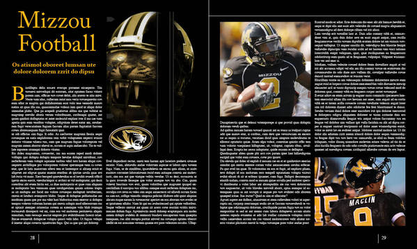
The double page spread I created was a creation that I felt was the easiest to make. The hardest part was probably creating a story. But with the help of my samples, I feel that it became easier for me. But I had noticed that in my page I used the same font for the title and the text. I also need to change the background color because I feel that the all white background does not make the text pop out. Also the image I may alter it a little bit and take away the batter from the image. But since these samples of these task have been improving, the final magazine will turn out even better.
The double page spread I created was a creation that I felt was the easiest to make. The hardest part was probably creating a story. But with the help of my samples, I feel that it became easier for me. But I had noticed that in my page I used the same font for the title and the text. I also need to change the background color because I feel that the all white background does not make the text pop out. Also the image I may alter it a little bit and take away the batter from the image. But since these samples of these task have been improving, the final magazine will turn out even better.
Wednesday, November 20, 2019
Double page spread Preliminary task
Here is a sample double page spread that I created for the preliminary task.


Saturday, November 16, 2019
Double Page Spread Examples
In this post I will post some double page spread examples that I will use as examples to create my own in my magazine.


Friday, November 15, 2019
Contents Page Evaluation
Evaluation:
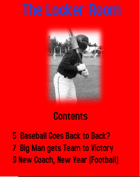
During creating my content page I was unsure of the background color but I chose to go with red which matches the color of the team. Then to contradict the color I put the image in grey and black and the lettering in black so that they pop out. The title of the page is in blue as the team I am doing is the American Patriots. I also did a 1 image content page because I felt that it was the best way for the page to look. Also the image is a baseball picture but the story titles have to deal with every sport so that there is a variety of stories for the people to choose from.
The next time I do a content page I will put what issue the magazine is and the date on the page. I will also add a lighter background and a little description under each article name so that it gives the reader an understanding of what the stories will be on.
Thursday, November 14, 2019
Saturday, November 9, 2019
Table of Content Examples
In this post I would like to provide some sample content pages that I will be basing my ideas off of. In all these following images they are all one page table of content samples and they all have one main image and multiple smaller images to catch the readers attention and engage them into the story.
In my sample design I will probably use a large main image and 2 or 3 smaller images that correspond to the other articles.


Thursday, November 7, 2019
Sample Cover Evaluation
Evaluation:
The preliminary task has allowed me to gain an understanding on how to approach the cover, table of contents, and double page spread. It has also allowed me to use different samples from the internet so that I am able to create my own samples to then creating the actual original magazine. To create the cover I used a website called poster my wall and I have became comfortable using the website and now it gives me a variety of options to use like indesign when creating my magazine.
Layout:
The layout of the cover sample I created was taken by a sports illustrated magazine that I had seen at the stores. Also the image used was from a player of the American Senior High School team. Also through my surveys the students would love to see the schedule so I inputted some upcoming games so that the students may go out and watch the games.
Text Style and Photography:
Through my own research I used the colors of the school for the magazine and for the text. The use of the font and color is to engage the reader as the color makes the words pop out in front of the main image. I also made the image the biggest part of the magazine because through my research, images is what engages the audience. But what I learned through the process is that the image should have no background and the next time I create my cover I will ensure that I fix that issue.
Wednesday, November 6, 2019

Saturday, November 2, 2019
Athlete Cover Examples
Through my research and survey responses, I have decided to go with a single athlete on the cover or the "game changers" of a team which is a maximum of three athletes and make him/them pop out so that it stands out to the consumer. The image will cover most of the page and will make the audience focus on that player while a team image on a cover will have less emphasis and will need more content to describe the team. I may also combine different types of elements to the cover and more smaller images which is what the consumers want according to my survey.
Here are some single athlete cover examples:


Here are some covers with the teams "game-changers" on the magazine:

*Game changer are players who are big components of a team and are the stars that help the team win.
Here are some single athlete cover examples:
Here are some covers with the teams "game-changers" on the magazine:
*Game changer are players who are big components of a team and are the stars that help the team win.
Friday, November 1, 2019
Magazine name
Through my research I have done, I have found four names that have interested me for the title of the magazine.
The four names are:
- Bench Report
- Locker room
- Primetime
- Mr. Clutch
Subscribe to:
Posts (Atom)